-
Shop
- Advanced Technologies
- AI Career Advantage Collection
- AI Skills
- AI Skills for Creators & Freelancers
- AI Client Management
- AI Ethics
- AI Mindset
- AI Tools & Prompts
- AI Writing & Content Creation
- Audio, Voice & Music
- Design & Visual Creation
- Email, Messaging & Communication
- Freelancing & Business
- Marketing, Ads & Conversion
- Productivity, Workflow & Automation
- SEO & Search Optimization
- Social Media Content & Growth
- Strategy, Planning & Analytics
- Video Creation & Editing
- Bathroom
- Beauty
- Best-Sellers
- Car Accessories
- Car Buying & Ownership
- Confidence
- Dating & Social Skills
- Digital Resources
- AI & Technology
- Budgeting & Saving
- Cozy Feast Collection
- Electronics & Technology
- Emotional Intelligence
- Entrepreneurship & Business Growth
- Financial Education
- Financial Independence
- Financial Mindset & Psychology
- Goal Setting
- Hobbies
- Kitchen & Recipes
- Leadership
- Mindfulness
- Mindset
- Motivation
- Online Business
- Positive Thinking
- Productivity
- Self Confidence
- Sleep Improvement
- Smart Life with AI
- Stress Management & Relaxation
- Travel Planning
- Yoga & Fitness
- Yoga & Mind-Body Practices
- Education & Learning
- Family & Parenting
- Gadgets
- Health & Beauty
- Health & Wellness
- Home & Garden
- Home Styling & Organization
- Home Supplies
- Kids & Babies
- Legend Footwear Brands Collection
- Online Business for Beginners
- Parenting & Child Development
- Patio, Lawn & Garden
- Personal Growth
- Personal Style & Fashion
- Pet Care
- Pet Lifestyle & Wellness
- Pet Supplies
- Pets
- Smart Amazon Shopping
- Stress Relief & Relaxation
- TikTok Growth & Monetization Mastery
- Travel
- Travel & Adventure
- Wealth
- Wellness
- Popular
- Best deals
Converse Youth vs Adult Cues: Campaign Styling Checklist
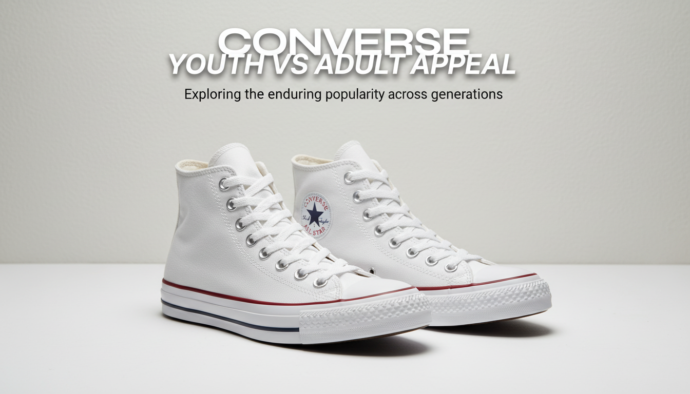
Converse can signal “youth” or “adult”—it depends on the surrounding cues
Converse can read as playful, nostalgic, edgy, minimal, or even premium depending on what’s happening around the shoe: the outfit proportions, the palette, the photo style, the copy tone, and the offer structure. That’s why brands sometimes end up with mixed signals—product pages say “timeless essential,” while social content feels like a chaotic trend montage. For more guidance, see Converse Social Media Strategy: Case Study | Enrich Labs.
The checklist below helps separate “youth-coded” versus “adult-coded” signals across styling, messaging, channels, and offers so creative decisions stay consistent from campaigns to landing pages. Neither direction is “better.” The goal is clarity: a customer should instantly understand the vibe, the use case, and the social setting. For further reading, see The Relationship Between Brand Heritage and Lasting Appeal.
What “youth appeal” and “adult appeal” mean for Converse-based styling
Youth appeal tends to emphasize experimentation, trend-cycling, bold contrast, and identity signaling (clubs, fandoms, subcultures). Styling often looks intentionally “in the moment,” and the shoe becomes a badge: it’s part of the outfit’s message, not just a functional base.
Adult appeal tends to emphasize versatility, quality cues, restraint, and context-appropriate styling (work, travel, smart casual). The shoe still has personality, but it’s framed as a reliable staple—something that fits real schedules and multiple settings.
The key is that the same Converse silhouette can serve both audiences if you intentionally choose the surrounding cues—fit, palette, accessories, copy, and photography—rather than mixing them randomly within the same asset.
Checklist: visual styling cues that shift perception
When a campaign “reads younger” or “reads older,” it’s rarely one detail. It’s the stack of signals working together. Use the quick scan table to spot what your creative is communicating at a glance.
Youth-coded vs Adult-coded cues (quick scan)
| Brand cue | Leans youth | Leans adult |
|---|---|---|
| Palette | Neon, primary pops, high contrast | Neutral, tonal, muted accents |
| Fit + proportion | Oversized top + wide leg, cropped layers | Balanced proportions, tailored or classic fits |
| Styling details | DIY laces, charms, visible branding | Minimal branding, refined textures |
| Setting | School, street hangouts, concerts | City errands, casual office, travel |
| Photography | Flash, candid, motion blur, collage | Natural light, clean composition, editorial spacing |
| Copy tone | Slang, playful hype, inside jokes | Clear benefits, confident, understated |
Color strategy: Brights, playful color blocking, and loud contrasts tend to skew younger. Neutrals, tonal dressing, and limited palettes tend to skew older—especially when the shoe becomes a controlled accent instead of the loudest element.
Silhouette pairing: Oversized hoodies, baggy denim, micro-trends, and exaggerated proportions often read youth-coded. Straight-leg denim, tailored trousers, and clean layers often read adult-coded.
Condition and finish: Distressed, DIY, patched, or sticker energy reads younger. Crisp, well-maintained pairs—or intentionally “heritage” styling with classic materials—read older.
Accessories: Novelty bags, chunky jewelry, bold socks, and playful add-ons skew youth. Leather goods, minimal jewelry, refined textures, and simpler lines skew adult.
Hair and grooming: Experimental color/cuts skew younger; polished or intentionally understated grooming skews older. Even with the same outfit, grooming can flip the perceived audience.
Checklist: messaging and offer design that aligns with the audience
Once the visuals set expectations, messaging should confirm them—fast. A mismatch (youth visuals with corporate copy, or adult visuals with hype slang) creates friction.
Value proposition: Youth-coded positioning often wins with novelty, drops, and self-expression. Adult-coded positioning often wins with versatility, comfort, and “goes with everything.” If you’re writing product benefits, adult-coded copy tends to reward specifics: comfort cues, materials, and what the shoe works with.
Social proof: Youth-coded proof often performs through creator-led content and UGC-heavy community signals. Adult-coded proof often performs through review-led, detail-focused reassurance (comfort over a full day, durability, ease of styling).
For practical guidance on microcopy choices that reduce confusion, Nielsen Norman Group’s UX writing resources are a useful reference: https://www.nngroup.com/articles/.
Checklist: channel and creative format choices
Platform expectations: Use discovery-led platforms for bold hooks and fast identity cues; use intent-led channels for clear benefits, fit guidance, and proof. If you’re validating audience behaviors, Pew Research is a helpful baseline for broad social usage patterns: https://www.pewresearch.org/internet/.
Brand positioning guardrails to prevent mixed signals
Audit touchpoints: Product pages, ads, social posts, and post-purchase emails should reinforce the same appeal cues. If you’re using Converse brand references, keep your factual brand details aligned with the official source: https://www.converse.com/.
How to use the checklist in 15 minutes (fast workflow)
What’s included in the digital download
If you want a ready-to-use framework for approvals and campaign consistency, the Converse Youth vs Adult Appeal Checklist (digital download) pulls the cues into a practical, repeatable review process—useful for teams juggling product photography, social content, and landing pages.
- Speak Up, Shine Bright: Unlocking Confident Communication (helpful when aligning brand voice and internal feedback loops).
- Coffee-Ready Cozy – What to Wear for Coffee Meetups Checklist (useful for building context-based outfit stories and lifestyle creative).
FAQ
Can one brand successfully target both youth and adults with Converse styling?
Yes—separate audiences by collection, landing page, or campaign series, and keep each individual asset consistent across styling, setting, copy, and offer structure to avoid mixed signals.
What’s the fastest way to tell if a campaign leans youth or adult?
Check three elements first: palette (bright vs tonal), setting (school/street hangout vs city errands/work-adjacent), and copy tone (slang/hype vs clear benefits). If two of the three point the same way, the campaign will typically read that way.
Does “adult appeal” mean formal or expensive?
No—adult appeal usually means versatile, context-flexible, and detail-conscious. Adult-coded campaigns can still feel casual and affordable while using restrained styling and practical messaging.
Recommended for you


AI Car Insurance Cost Estimator: Budgeting Checklist
Jun 26, 2026
Better Data for Better Decisions: A Team Workflow
Jun 26, 2026













Leave a comment